Blog by Artist David Esslemont about design, illustration, printmaking, bookbinding, and publishing – for everyone interested in books and creativity.
Wednesday, December 30, 2009
Café Wall illusion
Returning to work on the Florilegium I decided to use details or elements of the scanned leaf prints to create geometric patterns. After a number of experiments exploring the possible variations I discovered I had created an image that was creating optical illusions. Horizontal rows appearing to coverge on alternate rows! I printed it out, but the illusion had dissapeared. It worked in InDesign, but not in print. Returning to the InDesign document I realized the on-screen version was displaying the image box strokes. Changing these to a colour that represented a midpoint in the image, it worked in print as well. Further investigation revealed I had re-created what is known as the "Cafè Wall Illusion", as described by Professor Richard Gregory.
Saturday, December 26, 2009
Cooking and book making
You never forget how to ride a bike. But first, you have to learn, and then you can explore the world. So it is with cooking and book making.
As a boy scout I learned how to scramble an egg, to make "benders" and "twisters", and how to bake potatoes in a "biscuit tin oven" (they ended up with an exquisite smoked flavour that I can now attribute to the oak wood fire I built around the "oven"). Today I scramble an egg without thinking, adding more butter and creamy milk and aromatic fresh ground black pepper than before and stirring all the ingredients together in the pan as I start to cook. I still recall the direction to remove the eggs from the heat before they finish cooking, otherwise they will separate.
Like riding a bike, there are elements of cooking you never forget. But, as they say, there is more than one way to skin a cat, and there is more than one way to scramble an egg. And so, more often than not I find myself searching for a new recipe, a different method of preparing and cooking the staples. I am interested in food, and trying new techniques, combinations and ingredients is absorbing.
Cooking has become an extension of my creative work as an artist. I am constantly looking for that perfect blend of the best and freshest ingredients. Seeking to widen my culinary expertise and experience. And what may seem like "old hat" to some I am only just discovering, for example: white "ragu" – white wine, milk and long slow cooking [Marcella Hazan]. Thanks to Susan Filter for introducing me to MH. As with the books I make, my quest is the elegance of perfection combined with the vivacity of the spontaneous.
Sometimes, making a book seems like second nature, like riding a bike, or making scrambled eggs. My first recollections of making books are learning how to make single-section books at junior school, and as a teenager binding twelve issues of my Aeromodeller magazine.
This Christmas I made some gifts: a cloth-covered, case bound, French-sewn guard book, and three gatherings of laser printouts, "bound" in the Japanese stabbed binding style.
The guard book was relatively straightforward. Choosing an acid-free paper ("aren't all papers archival these days?" asked Garrison Keillor when I described the physical attributes of my books), I gathered twelve 16 pp sections. My French-sewn binding is an "all along" stitch, without tapes. In a moment of revelation I realize how adept I have become at making a book, from scratch.
There was a time when cooking was a part of my work routine – making boiling water flour paste, and melting hide glue, filling the workroom and house with bovine aromas (does aspic å la Elizabeth David or Julia Child smell the same?)
To bind the laser-printed sheets I needed a simple solution. A perfect binding would suffice but the paper reacted badly, becoming wavy, even though the grain direction ran parallel to the spine. Inspired by two volumes of an old Japanese textbook, I decided to use a stabbed sewing structure. And so I learned another method of binding.
Cooking and making books are both productive processes that combine a variety of elements together to form something that has a purpose or function and also has aesthetic qualities that may delight or stimulate many senses. The well-designed, well-made book with valuable contents is like the well planned, perfectly cooked and presented dish. Both can combine elements of the traditional or the innovative, be controversial, or be audacious or austere, disturbing or comforting.
Both are rewarding.
Sunday, December 20, 2009
Christmas Greetings
With best wishes for a
Happy Christmas and
a Peaceful New Year.
David
*************************************************
Wednesday, December 16, 2009
What format should I use for the Florilegium?
And . . . my advice in Inside the Book is to also consider the best medium. For example: would the work be better suited to being printed letterpress (from photopolymer plates); or printed digitally (inkjet), in house; or sent out to a POD company; or produced as an e-book; perhaps a portfolio of prints; maybe an audio book, or perhaps a video? I also ask the question who is the intended reader, what is my market? I will write more on marketing in future posts.
This begs the question, what is this book?
At present Florilegium Solmentes is a growing number of digital “flowers” inspired by Luca Pacioli’s account of nature printing and the idea for a book. The book will begin with Pacioli’s text, in Italian and English with my commentary and a description of how I print from leaves etc. Included will be actual leaf prints, together with other impressions and interesting asides and glosses, for example it transpires that many leaves have symbolic meaning and medicinal uses. Then follows a detailed description of how (and why) I began to use the images digitally.
David Schoonover and friend viewing pages from Florilegium Solmentes on display in the Preus Library, Luther College.
It was my intention at the outset to create large flowers and they are arguably most impressive when their diameter is around 400 mm (17 ins). Canvassing the opinion of potential buyers/collectors is important and I am grateful to David Schoonover for his views on the matter. You can see more detail in the larger prints and as graphic images they have more presence. On the other hand they have a certain charm when reproduced as miniatures, something I was prompted to try following a suggestion by Jody Williams.
For the time being my plan is to print the flowers digitally on sheets 17 x 22 ins (432 x 559 mm), as a portfolio with an accompanying book of a more manageable size.
Tuesday, December 15, 2009
Creating (dissecting) the digital flower
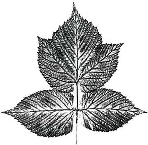
1 One leaflet was dissected from the blackberry (back) leaf image.
2. The image was modified in Photoshop.
3. The modified image was placed in an InDesign document 280 x 280 mm (11 x 11 inches), then duplicated and rotated around a central axis.
4. The "petals" are grouped together.
5. The group was duplicated, rotated and scaled down
6. The scaled down petals were pasted over the first group of petals
7. This procedure was repeated some nineteen times to create the finished flower.
Monday, December 14, 2009
Blackberry and Raspberry leaf prints
Blackberry (back)
Blackberry (front)
Raspberry (back)
Raspberry (front)
The leaves of soft fruit printed very well. Prints from the back or underside of the leaf were generally more more detailed. Printing was messy and it was difficult to get sharp impressions.
More scans to come . . . in the next post.
Sunday, December 13, 2009
Luca Pacioli De Viribus Quantitatis
Opening from Pacioli’s De Viribus Quantitatis, folios 259v-260r, Biblioteca Universitaria, Bologna, codice n. 250.
I began with this account of nature printing by Luca Pacioli from his De Viribus Quantitatis (On the power of numbers) and started printing from leaves.
To learn how to reproduce single leaves, chiefly those with veins
That is, those which have ribs or veins, such as the leaves of violets, lesser celandine, grapevine, sage, stonecrop, ox-tongue or roses.
Take finely ground charcoal, or lampblack which is used to print books, and is much better. Mix it well, adding common oil, then with a sponge or brush spread it on a clean surface in a thick layer. Then take your leaf, well cleaned, put it vein side down on to the inked surface, and put a clean sheet of paper carefully on top of the leaf. Then press the paper with your hand or fingers, but not too hard, as the leaf should not be broken. Once the leaf is coated with black, put it on to another white sheet of paper, taking care it does not move. Then put another sheet of paper over it, and apply some pressure to it: the black impression you want will stay on the paper. It will look very good, but only the outlines will be seen; then with verdigris or some other green water colour paint it carefully and it will look very natural, as you will see.
I used ready-made oil-based printing ink and polyurethene ink rollers to ink both sides of the leaf and pressed it [using another roller] between sheets of Zerkall mould made paper.
Saturday, December 12, 2009
Solmentes Florilegium
Ideas for Books
About David Esslemont
Fine printing in Wales
From 1985 to 1997 Esslemont was Controller (managing and artistic director) of the Gregynog Press in Wales. At Gregynog he designed and printed several prize-winning books including Giraldus Cambrensis for which he won the Felice Feliciano Award for Book Design in 1991. He commissioned artists to illustrate the books and many, such as Wrenching Times, with colour wood engravings by Gaylord Schanilec have become highly sought-after collector's items. At Gregynog he was responsible not only for the design and printing but also the strategic development, marketing and general management.
Design
As a designer Esslemont has worked on a variety projects from a book stamp for the Bodleian library to a whole new visual identity for the University of Wales Swansea, including design guidelines and the application to signage and marketing. Many smaller commissions such as bookplates have been undertaken for private individuals and the design of stationery and logos for associations and small businesses. Digital typesetting and design projects include books for the British Library, Previous Parrot Press, and the first two issues of Parenthesis for the Fine Press Book Association.
Printing
Besides printing his own publications Esslemont also undertakes commissions. For example: All in Good Time, the autobiography of handmade watchmaker George Daniels, for the Peoples Archive, and The Prelude for the Wordsworth Trust.
Bookbinding
From the outset Esslemont has also bound his books himself and most were issued in leather bindings: full leather, quarter leather and designed fine bindings, often with gold tooling. Today, David Esslemont is pleased to offer his services as a bookbinder for small editions of fine print books. For example All in Good Time and Angels for the Celtic Cross Press. He also welcomes commissions for one off bindings such as the binding on Wood Engravings by Agnes Miller Parker. Occasionally he finds a book that inspires and will create a binding specially for that volume.
The Wordsworth Trust
Esslemont was invited in January 2005, by the late Robert Woof, inspirational Director of the Wordsworth Trust, to be an Artist in Residence with the Trust in Grasmere in the English Lake District. This provided a unique opportunity to pursue watercolour painting and work on illustrations for a projected new edition of Wordsworth's poem, The Prelude.
Minneapolis
In Minneapolis during the summer of 2004 Esslemont printed The Folly and Wickedness of War at the Minnesota Center for Book Arts where he enjoyed the privilege of being an artist in residence.
Esslemont has lectured widely in the U.K. and U.S.A., and his work can be found in both private and public collections worldwide. His archive is held at the University of Iowa. He has been artist-in-residence with the Wordsworth Trust in Grasmere, England, and Minnesota Center for Book Arts (MCBA) in Minneapolis. His recent work includes illustrated editions of John Keats' poem To Autumn, Wordsworth's The Prelude, and Barack Obama's inaugural address.
Esslemont is member of the Double Crown Club and the Wynkyn de Worde Society.
About Solmentes Press
History
Esslemont began publishing in 1978 and his books were issued with the imprint ‘David Esslemont’. The name Solmentes Press was created in 2000 and first used for Inside the Book. While appearing to have a higher meaning, Solmentes is simply an anagram of Esslemont.
Letterpress
His first books were hand-printed from metal type on a Columbian press, today they are still printed letterpress, but from photopolymer plates on a Heidelberg cylinder press. The letterpress books are generally categorized as ‘fine press’ and printed in limited editions of around 200 copies, sometimes less.
Digital
Inkjet printers are also used to make digital books and these tend to be classified as ‘artists books’. The subject matter of Esslemont’s books range from bibliography to poetry. My Fellow Citizens, Barack Obama’s inaugural address, is a new departure that reflects the publisher’s independent vision.
Passion for books
Above all there is a desire to make distinctive, elegant and readable books that are not only a joy to read but also a delight to all the senses. The choice of materials and attention to detail reveal a passion for books and respect for the history of printing.
About David Esslemont
Friday, December 11, 2009
Hello
I am an artist, I make books. It is my intention to give you, the reader, the collector, the curious, an insight into my creative thoughts and processes. Over thirty years ago I started to record such things in a series of notebooks with fanciful titles such as: "Notes, Theory, Experiment, Speculation on Art: a diary of my 'artistic' experiences". This blog is a continuation of those notebooks, with the focus now on the conception, writing, design and production of books.
I hope you find something of interest.
Podcast: David Esslemont on the history of the Gregynog and Solmentes Presses
Gregynog Hall Nigel Beale aka The Literary Tourist , came to visit and recorded our conversation in which he asked me about the history...
-
Saturday March 9, from 10 am to 5 pm St Vincent Ferrer Church, 869 Lexington Avenue at 66th Street, New York, NY Solmentes will be s...
-
Resistance by Simon Armitage, a poem about the war in Ukraine – preview in New York – April 23, 2022Solmentes Press will preview Resistance by Simon Armitage at the Manhattan Fine Press Book Fair on Saturday, April 23, from 10 am to 5 pm at...